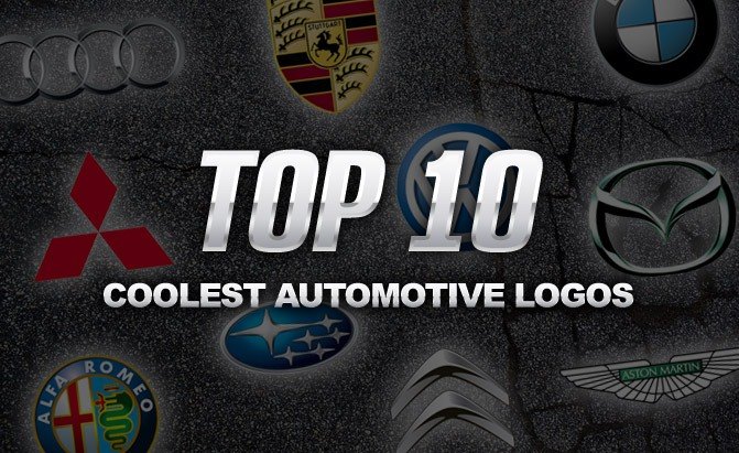
Top 10 Coolest Automotive Logos

Every car company has its own logo and, like the vehicles they build, some are better than others.
Just take a gander at Toyota’s top-heavy oval emblem. Despite its simplicity, this symbol isn’t terribly inspiring, nor is the winged-arrow insignia plastered on Skodas. Talk about weird! Like these examples, the GMC logo is nothing more than a trio of consonants. How boring! It’s never going to win any graphic design awards.
Fortunately, there are still plenty of vehicular brands with elegant and classy logos with interesting backstories. Here’s a list of our 10 favorite.
10. Mitsubishi
We start with a troubled Japanese automaker. In North America at least, Mitsubishi has been struggling for decades, hobbled by questionable quality and a limited range of substandard products. Currently, it doesn’t even offer a midsize sedan, which would compete in a huge segment of the market. Still, in spite of its poor showroom performance, the company does have an appealing logo, one that’s graphically simple and very clean. Mitsu means three in Japanese, while hishi means water chestnut and denotes a diamond shape, so the logo is the literal translation of the Mitsubishi name, which means “three diamonds.”
9. Aston Martin
Another one of the coolest automotive logos out there belongs to Aston Martin. Sure, this British brand builds some killer products, but its emblem is genuinely nifty, comprised of stylized wings, stretched wide with the text of its name nestled neatly in the center. Curiously, the automaker has carried this motif through to the rear end of some models, where the tail lights mimic the logo’s feather.
8. Citroën
Not only does Citroën deserve an award for sporting an umlauted letter in its name, but it’s also worthy of praise for having an appealing logo. Yes, this French automaker’s double-chevron moniker is not only graphically pleasing but also rooted in history. The emblem is a stylized version of a herringbone gear, a design that cancels out the axial thrust found in normal helically cut gears. Supposedly, company founder André Citroën spotted this clever innovation while in Poland. Apparently, he liked it enough to use it as the logo for the company that bears his name.
7. Subaru
Subaru is best known for its rally-racing heritage and unique devotion to all-wheel drive, but in addition to all of this, it also has a pretty neat logo. Do you know what the firm’s twinkling emblem represents? Well, if you’re an amateur astronomer, you might have a clue, if not, you’ll still probably enjoy this tidbit of info. The company’s logo actually represents the Pleiades star cluster, which is found in the Taurus constellation. Why this particular group of stars? Subaru is the Japanese word for a group of stars found in the constellation.
6. Volkswagen
For those of you who aren’t familiar, the history of Volkswagen is rather dark, and we’re not referring to all the soot from its recent diesel-emissions scandal. The people’s car brand directly traces its roots back to Nazi Germany. In the mid-1930s, Hitler wanted an affordable car that could mobilize the Reich’s population. Ultimately, the company’s Beetle would do this, even if it didn’t hit its stride until well after the Second World War ended. Anyhow, despite its troubled past, Volkswagen has one of the coolest, most graphically pleasing emblems of any automaker. It’s comprised of a capital “V” perched atop a large “W,” with everything circumscribed neatly by a circle. It’s clean, elegant and still cool all these years later.
SEE ALSO: Top 5 Reveals From the Paris Motor Show
5. Mazda
Next up, another Japanese automaker. Rendered in shiny chrome, Mazda’s logo is both simple and intriguing. Clearly, it’s a stylized “M,” but this motif also bears more than a passing resemblance to a blooming tulip. Additionally, those with a keen eye and vivid imagination might notice a soaring bird with its wings spread wide. What do you see in this automotive Rorschach test?
4. Porsche
Porsche is one of the most coveted brands in the car world. Whether it’s the iconic 911 or Macan crossover, their Panamera sedan or lithe Cayman coupe, this firm’s sporty products are lusted after by enthusiasts around the globe. Given the high esteem it’s held in, the company deserves a suitably regal logo, which is exactly what it has. Curiously, the Porsche emblem is a hybrid of sorts, with city of Stuttgart’s coat of arms plunked in the center of a field borrowed from the heraldic symbol for the Kingdom of Württemberg. Makes sense, right? We didn’t think so. In any event, just enjoy the cool logo and inspiring vehicles.
3. Alfa Romeo
Another automaker with a seriously beautiful emblem is Alfa Romeo. Just like Porsche’s, it’s comprised of various heraldic symbols. The prominent red cross represents the city of Milan, this prestigious automaker’s birthplace. As for the crowned serpent, it stands for the House of Visconti, a noble Italian family. How neat is that? Owning an Alfa Romeo is kind of like being friends with royalty… sort of.
2. Audi
One of the most elegant automotive logos of all time belongs to Audi, though due to the brand’s tumultuous history, it’s one of the most difficult to explain. In short, this firm’s emblem is comprised of four interlocking rings, one for each brand that formed the now-defunct company Auto Union, which is the direct predecessor to the Audi marque we know today. The companies represented in this beautifully rendered logo include Horch, Wanderer, DKW and Audi. It’s a difficult story to explain, but the result is one of our favorite logos.
1. BMW
Finally, we come to BMW. Unquestionably, this fabled German luxury car maker has one of the nicest insignias in the automotive world. Its circular emblem represents several things. First, the blue-and-white motif is a stand in for the Bavarian flag. Remember, the firm is headquartered in Munich, the capital of this German federal state. Only a decade after its creation did it also gain an association with the aircraft propeller from an aircraft engine magazine with the roundel overlaid in front of a stylized aircraft propeller, one blurred by rotating at a high rate of speed. This is a nod to the high-flying engines they began building in the 1920s. For its graphic simplicity, overall elegance and rich history, you can’t beat the BMW roundel.
Check out more Top 10 Lists

Born and raised in metro Detroit, Craig was steeped in mechanics from childhood. He feels as much at home with a wrench or welding gun in his hand as he does behind the wheel or in front of a camera. Putting his Bachelor's Degree in Journalism to good use, he's always pumping out videos, reviews, and features for AutoGuide.com. When the workday is over, he can be found out driving his fully restored 1936 Ford V8 sedan. Craig has covered the automotive industry full time for more than 10 years and is a member of the Automotive Press Association (APA) and Midwest Automotive Media Association (MAMA).
More by Craig Cole





















Comments
Join the conversation
Hard to understand why Kia is not listed.
It's hard to believe that the author's choices aren't affected by his preference in cars. It's odd to me that no American cars are included. I think the Chevrolet "bowtie" is certainly more attractive and iconic than Mitsibushi, Audi or even the BMW logo. Ditto for the Ferrari, Mercedes and even the lovely script that is the Ford logo beat out most of those selected above.