Who Has the Better Logo Redesign: GM or Kia?

Both General Motors and Kia presented new brand logos this week—but which is best?
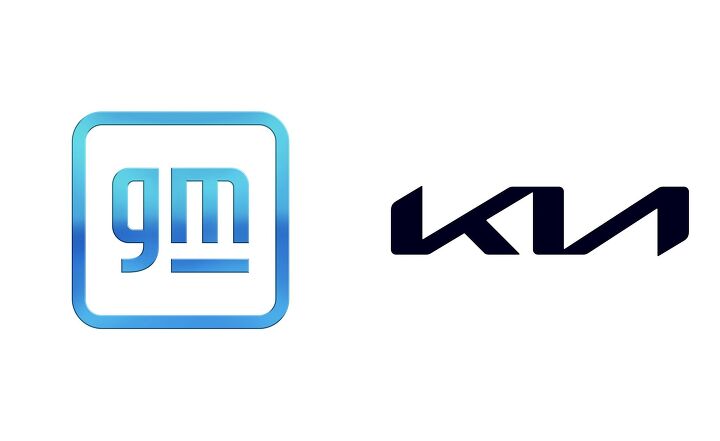
It’s not often car manufacturers tinker with their badge. This week we saw two. We’ve broken down the redesigns for both General Motors and Kia down below, and we pose the question to you, dear readers: which one did it better?
General Motors
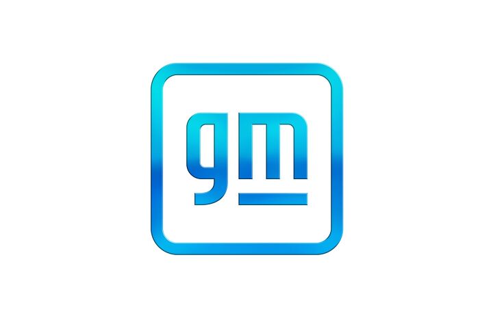
Earlier today, General Motors unveiled its latest logo, only the fifth time the company has significantly changed it in 113 years. It’s a familiar evolution of the previous badge: it’s still roughly square-shaped, and the two initials remain in place. The General has gone for lowercase lettering this time though—think “i’m loving it” from McDonald’s. GM has also switched to a softer, curvier font, for what it says is a “modern, inclusive feel.”
The bounding box is now a curved-corner square, similar to app icons on an iPhone. GM’s thrown a blue gradient on the whole package, which has evoked more than a few comparisons to ’90s WordArt across Twitter. The underline moves over to just the m, with the negative space between it and the letter meant to show a plug. The American company isn’t being coy: this rebrand is all about its Ultium battery tech, and a heavy push towards EVs that will see 30 new models across its brands by 2030.
SEE ALSO: 2020 Cadillac CT5-V Review: My Name is My NameThe redesign coincides with the brand’s new tagline, “Everybody in.” GM is very specifically tying the rebrand to its massive $27-billion investment in EVs, and believes now is the tipping point for the technology.
Which vehicles will lead GM into the electric future? Right now we’ve seen the Cadillac Lyriq and GMC Hummer EV, and both will touch down within the next year or two. We’ll find out more at GM’s virtual CES showcase, and the restyled corporate website will go live on Monday, January 11.
Kia
Kia has gone a very different direction for its new identity. Debuting on Wednesday, it ditches the staid oval badge of before for an angular wordmark. The old logo was in use since Kia began selling cars on this continent a quarter-century ago.
The Korean automaker used hundreds of firework-launching drones to show off the logo—enough to earn it a Guinness World Record, in fact. Kia says the edgy new look symbolizes the brand’s “confidence and commitment to customers.” We’ll leave you to decide that one. Kia’s cars have changed drastically since the ’90s, and we’d argue this new badge should look right at home in the Tiger Nose grille of the new K5 or Sorento. Unlike GM, Kia has only shown off the new logo in flat black; not counting the fireworks display, anyway. Kia also hasn’t tied its design so closely to its electric future, which will focus on the Hyundai Group’s E-GMP platform.
SEE ALSO: 2021 Kia Sorento Review: First DriveKia has a new slogan as well: “Movement that inspires.” The tagline, logo, and what’s sure to be cars featuring the latter will feature on a digital “New Kia Brand Showcase” event Friday, January 15.
Which of these two redesigns do you think is more successful? Sound off in the comments.
Become an AutoGuide insider. Get the latest from the automotive world first by subscribing to our newsletter here.

Kyle began his automotive obsession before he even started school, courtesy of a remote control Porsche and various LEGO sets. He later studied advertising and graphic design at Humber College, which led him to writing about cars (both real and digital). He is now a proud member of the Automobile Journalists Association of Canada (AJAC), where he was the Journalist of the Year runner-up for 2021.
More by Kyle Patrick















Comments
Join the conversation