


MyFord Touch Version 2.0: What's New With the Faster, Easier-to-Use System – Video
Being a technology leader in the auto industry requires a thick skin. BMW had its reputation smeared when it first introduced iDrive back in 2001 and Ford is now suffering similar technology growing pains since the release of its MyFord Touch system in the 2011 Ford Edge.
After complaints and criticism by consumers and the media, Ford has released version 2. 0. The changes, explains MyFord Touch specialist Michael Robbins, range from major to minute, though all of them, he takes extra care to point out, come from Ford listening to the critical feedback from customers and third-parties.
Get the Flash Player to see this player.
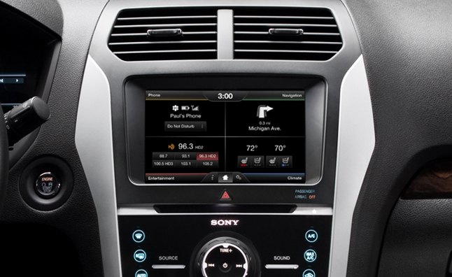
The changes are easily noticeable. MyFord Touch as a whole looks cleaner, and less cluttered than before. The four corners of the system now show only one line of information instead of two. Ford claims that the new fonts are 40% larger, wider and bolder, which can really help with readability.
Let’s take a closer look at the different areas where MyFord Touch has changed. In the images below, the old version is shown on the left, while the new version is on the right.
Dashboard:

On the dashboard alone you can see several important changes. The notification area in the middle of the top edge of the screen now only displays a clock, and has increased in size to fill out that space. The dashboard now shows much more relevant information and controls in each of its four quadrants. In top-left ‘Phone’ quadrant, drivers can easily see their phone’s battery level and network coverage with larger icons. In the top-right “Destination” quadrant drivers can see the next upcoming direction for their navigation, instead of it being a small icon beside a bunch of text filled buttons. In the bottom-left “Entertainment” quadrant you can have your radio presets, or controls for your CD, or MP3 player. Finally in the bottom-right ‘Climate’ quadrant, you can put your most used or favorite climate controls.
Navigation Screen:

The dashboard is really just the beginning of the update, as each of the separate pages in MyFord Touch has seen some sort of change. The most significant change happens in the navigation screen. Here the map looks much more modern. The old map looked cluttered, and it was difficult to read street names from a zoomed out view. Now, the whole map interface is cleaner and easier to read, especially street signs. Ford has improved certain elements, like the next turn, or current street information dialogues. Even the area to input a destination has seen a much needed cleaning up, as now search candidates are much easier to use, as well as the keyboard being spaced a little further from the home button. This should help reduce the number of frustrating accidental presses.
Climate Screen:

Another section that saw dramatic changes was the climate screen. Before the screen was cluttered and had some animations that slowed down the process of changing your cabin temperature. Now, all settings are brought to a flat screen, and unnecessary animations are removed, which creates a smoother, quicker feel when changing settings. Icons like the on the fan speed and seat warmer buttons provide cleaner information than before.
Entertainment Screen:

On the entertainment screen, the area on the left has seen some simplifying, and icons and images have been redone, to look less cluttered. Radio presets or playback control have moved into the middle from the right side. Additionally, Ford has added little graphics that look like LED lights to some buttons, so indicate what level you are on. This helps with presets so you don’t just cycle through aimlessly looking for your radio station.
Phone Screen:

Finally on the dial screen, the fonts have been improved, and are much easier to read. Similarly to the other screens, a few buttons have been moved away from the home button, to prevent accidental presses.
Performance:
Finally, Ford has addressed the complaints of sluggishness around MyFord Touch. Users have noticed that MyFord Touch is nowhere near as responsive as your smart-phone. With this update Ford claims that voice and touch response is at least twice as fast. Ford even claims some browsing functions are nine times faster. When testing the update we noticed that it certainly was more responsive, but there were some places like the navigation which still took a moment to load.
Update Process:

The update process seems quite easy: just plug the USB stick into the port and let the update run. The bad news is that it can take up to an hour to update, and the vehicle must be on while it’s updating.
These updates show consumers that their concerns and feedback aren’t falling on deaf ears. It should please Ford’s customers that they won’t have to trade in their car just to get the latest version of MyFord Touch. Ford says that USB packages are now mailing out to customers, so they can update right in their driveway. For those who want less responsibility, you can also take the car to the dealership to get it updated.

Sami has an unquenchable thirst for car knowledge and has been at AutoGuide for the past six years. He has a degree in journalism and media studies from the University of Guelph-Humber in Toronto and has won multiple journalism awards from the Automotive Journalist Association of Canada. Sami is also on the jury for the World Car Awards.
More by Sami Haj-Assaad


Comments
Join the conversation
The four corners of the system now show only one line of information instead of two. Ford claims that the new fonts are 40% larger, wider and bolder, which can really help with readability.